The shift away from greige
For nearly a decade, the default estate palette in South Florida was some version of greige — a warm gray with just enough beige to feel safe. In 2026 that reflex is gone. Designers we work with in Palm Beach, Jupiter Island, and Vero Beach are actively specifying color with more warmth, more depth, and — most notably — more contrast between rooms.
The change isn't just aesthetic. Ceiling heights on new Palm Beach construction have grown, glazing packages are larger, and reflected light off water is stronger than most inland markets. Neutral-only interiors read flat in that much light. Warm whites, mineral greens, and pigmented clays hold their character from morning through sunset.
1. Warm oyster whites
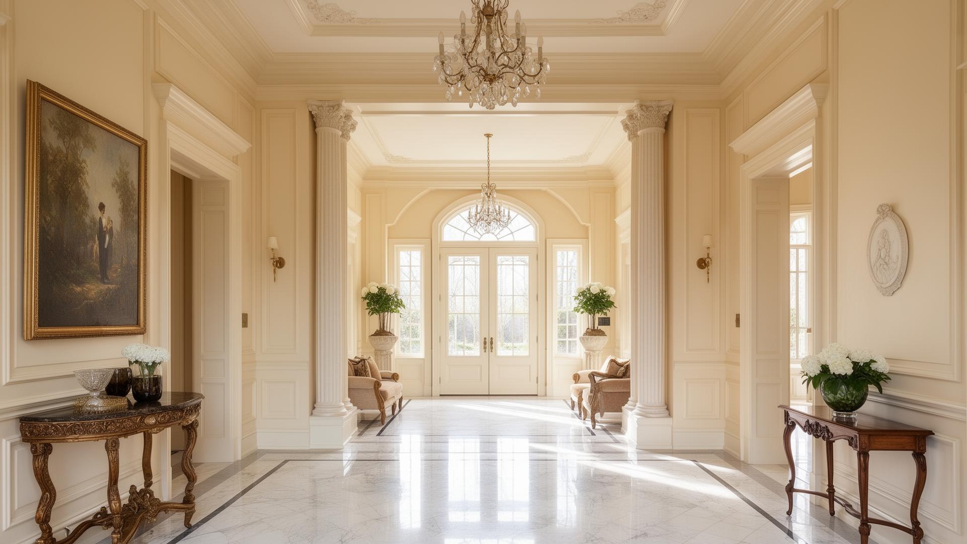
The dominant 2026 white is not cool, not stark, and not yellow. It's what our estimators are calling oyster white — a chalky, faintly warm white with an undertone that photographs almost pink in morning light and settles into pure ivory by afternoon.
- Reads clean without the clinical edge of pure white.
- Pairs with limestone, travertine, and unlacquered brass.
- Works flat on ceilings and eggshell on walls without visibly changing color.
We specify oyster whites most often for great rooms, primary bedrooms, and any room with west-facing water views. In north-light rooms we shift a half-step warmer to avoid a chalky look.
2. Terracotta and burnished clays
Terracotta is the sleeper trend of 2026. Not the orange terracotta of a 1990s Tuscan revival — instead, a muted, dusty clay that sits somewhere between plaster pink and aged rose. It works as a full-room color in powder rooms and dining rooms, and as an accent in Venetian plaster on a single wall.
We've been layering these tones over pigmented plaster rather than flat paint, because the specialty finish catches natural light and prevents the color from flattening under recessed LEDs.
3. Forested greens
Deep greens — moss, bay leaf, olive-black — are 2026's answer to the navy library of the last cycle. They're landing in offices, media rooms, and paneled dens on the Intracoastal side, where the view is landscape rather than water.
- Best in satin or matte on millwork; too much sheen makes green look plastic.
- Pairs naturally with antique brass, aged bronze, and walnut.
- We recommend painting trim, walls, and ceiling in the same green — the "color-drenched" effect makes the room feel deliberate rather than accidental.
How we specify color on-site
Never approve a color from a fan deck or phone screen. Our standard process for every estate is:
- Roll large draw-downs (2 ft × 2 ft minimum) on primed board in each candidate color.
- Place them on two walls per room — one on the wall you'll paint, one on the opposite wall.
- Review at three times of day: morning, mid-afternoon, and after sunset with artificial light on.
- Decide on the whole palette together, not one room at a time. Adjacent rooms bleed color through open doorways.
Mistakes to avoid
- Matching interior white to exterior white. They live under completely different light and shouldn't be the same product.
- Chasing "trend" without testing. A color that photographs well in Milan may go green in Palm Beach light.
- Under-specifying sheen. Flat hides drywall imperfection but shows every fingerprint in a home with children — we usually specify matte or eggshell for the living zones.
- Skipping ceilings. A ceiling in the same color as the walls, one shade lighter, transforms a room. We include this in every consultation.